The AppBar widget in Flutter is a material design component that displays at the top of a Scaffold. It provides a space for branding, screen titles, navigation actions, and other interaction elements (e.g., search, profile). It is highly customizable and often used in conjunction with a Drawer or TabBar.
The AppBar automatically adapts to the app's theme and can be customized with actions (like icons), flexible space (for widgets like images or search bars), and background colors.
¶ Components
import 'package:flutter/material.dart';

class AppBarComponent extends StatelessWidget implements PreferredSizeWidget {
  final Widget? title; // The title of the AppBar
  final Color? backgroundColor; // Background color of the AppBar
  final List<Widget>? actions; // Action buttons on the AppBar (e.g., Icons)
  final Widget? leading; // Widget displayed before the title, typically an icon
  final bool? centerTitle; // Whether the title should be centered
  final double? elevation; // The elevation (shadow) of the AppBar
  final Widget? flexibleSpace; // A widget displayed in the background
  final double? toolbarHeight; // Height of the AppBar
  final ShapeBorder? shape; // Shape of the AppBar (e.g., Rounded edges)
  final PreferredSizeWidget? bottom; // A widget (e.g., TabBar) placed at the bottom of the AppBar
  final IconThemeData? iconTheme; // Custom icon theme

  // Constructor
  const AppBarComponent({
    Key? key,
    this.title,
    this.backgroundColor,
    this.actions,
    this.leading,
    this.centerTitle,
    this.elevation,
    this.flexibleSpace,
    this.toolbarHeight,
    this.shape,
    this.bottom,
    this.iconTheme,
  }) : super(key: key);

  @override
  Size get preferredSize => Size.fromHeight(toolbarHeight ?? kToolbarHeight);

  @override
  Widget build(BuildContext context) {
    return AppBar(
      title: title,
      backgroundColor: backgroundColor,
      actions: actions,
      leading: leading,
      centerTitle: centerTitle,
      elevation: elevation,
      flexibleSpace: flexibleSpace,
      toolbarHeight: toolbarHeight,
      shape: shape,
      bottom: bottom,
      iconTheme: iconTheme,
    );
  }
}
¶ How to Use
import 'package:flutter/material.dart';
import 'app_bar_component.dart';
void main() {
runApp(MyApp());
}
class MyApp extends StatelessWidget {
@override
Widget build(BuildContext context) {
return MaterialApp(
home: Scaffold(
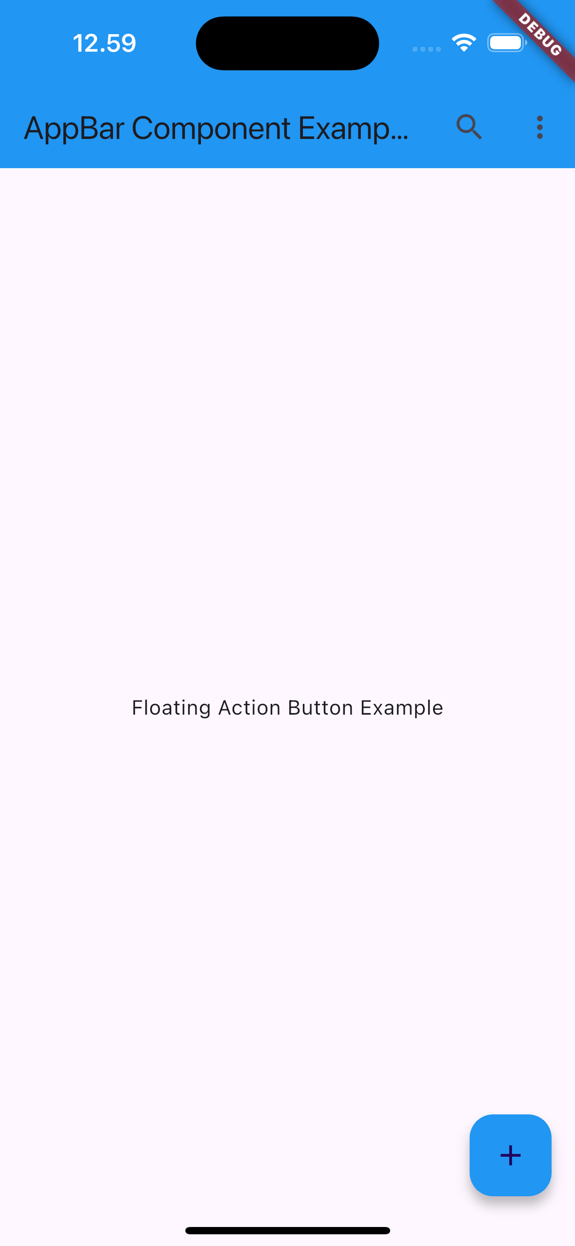
appBar: AppBarComponent(
title: Text('AppBar Component Example'),
backgroundColor: Colors.blue,
centerTitle: true,
actions: [
IconButton(
icon: Icon(Icons.search),
onPressed: () {
print('Search Pressed');
},
),
IconButton(
icon: Icon(Icons.more_vert),
onPressed: () {
print('More Options');
},
),
],
),
body: Center(
child: Text('Body Content'),
),
),
);
}
}
¶ Properties
¶ 1. title
The title of the AppBar, typically a Text widget, but it can also be a custom widget such as an image or logo.
AppBarComponent(
  title: Text('Home'), // Title as Text widget
)
¶ 2. backgroundColor
The background color of the AppBar. If not specified, it defaults to the primary color of the theme.
AppBarComponent(
  backgroundColor: Colors.blue, // Custom background color
)
¶ 3. actions
A list of widgets that appear on the right side of the AppBar. These are usually IconButtons for actions like search, notifications, etc.
AppBarComponent(
  actions: [
    IconButton(
      icon: Icon(Icons.search),
      onPressed: () {},
    ),
    IconButton(
      icon: Icon(Icons.notifications),
      onPressed: () {},
    ),
  ],
)
¶ 4. leading
A widget displayed at the start of the AppBar, typically an IconButton or a menu button (for use with a Drawer). If not provided, the AppBar defaults to showing a back button when appropriate.
AppBarComponent(
  leading: IconButton(
    icon: Icon(Icons.menu),
    onPressed: () {},
  ),
)
¶ 5. centerTitle
If true, the title is centered on the AppBar. The default behavior is platform-specific: titles are centered on iOS but left-aligned on Android.
AppBarComponent(
  title: Text('Home'),
  centerTitle: true, // Center the title
)
¶ 6. elevation
Controls the elevation (shadow) of the AppBar. A higher elevation value results in a more prominent shadow.
AppBarComponent(
  elevation: 4.0, // Set elevation for shadow effect
)
¶ 7. flexibleSpace
A widget that can be displayed behind the AppBar's title. It stretches to cover the entire AppBar, allowing for features like images, gradients, or animations.
AppBarComponent(
  flexibleSpace: Container(
    decoration: BoxDecoration(
      gradient: LinearGradient(
        colors: [Colors.blue, Colors.purple],
      ),
    ),
  ), // Gradient background
)
¶ 8. toolbarHeight
The height of the AppBar. If not provided, the default height is 56.0 pixels.
AppBarComponent(
  toolbarHeight: 70.0, // Custom height for AppBar
)
¶ 9. shape
Defines the shape of the AppBar. This property is often used to add rounded corners or custom edges to the AppBar.
AppBarComponent(
  shape: RoundedRectangleBorder(
    borderRadius: BorderRadius.vertical(bottom: Radius.circular(20)),
  ), // Rounded edges for AppBar
)
¶ 10. bottom
A widget that appears at the bottom of the AppBar, typically a TabBar in combination with TabBarView.
AppBarComponent(
  bottom: TabBar(
    tabs: [
      Tab(text: 'Tab 1'),
      Tab(text: 'Tab 2'),
    ],
  ),
)
¶ 11. iconTheme
Customizes the color, size, and opacity of the icons in the AppBar.
AppBarComponent(
  iconTheme: IconThemeData(
    color: Colors.white, // Change icon color to white
  ),
)