The Checkbox widget in Flutter is a material design component that allows users to toggle between two states: checked and unchecked. It's commonly used in forms, settings, and multi-selection interfaces. Unlike a Radio button, multiple Checkbox widgets can be selected at the same time. Flutter’s Checkbox also supports a tristate feature, which allows it to have an additional "indeterminate" state, often used for partially selected or grouped items.
¶ Component
import 'package:flutter/material.dart';

class CheckboxComponent<T> extends StatelessWidget {
  final List<T> items; // List of checkbox items
  final List<T> selectedValues; // List of currently selected values
  final ValueChanged<List<T>> onChanged; // Callback when the selection changes
  final Widget Function(T) labelBuilder; // Function to build labels for each checkbox
  final Color? activeColor;
  final Color? checkColor;
  final bool tristate;
  final bool? Function(T)? isSelected; // Custom function to control selection state

  const CheckboxComponent({
    Key? key,
    required this.items,
    required this.selectedValues,
    required this.onChanged,
    required this.labelBuilder,
    this.activeColor,
    this.checkColor,
    this.tristate = false,
    this.isSelected,
  }) : super(key: key);

  @override
  Widget build(BuildContext context) {
    return Column(
      children: items.map((item) {
        final isChecked = isSelected?.call(item) ?? selectedValues.contains(item);

        return ListTile(
          leading: Checkbox(
            value: isChecked,
            onChanged: (bool? checked) {
              final newSelectedValues = List<T>.from(selectedValues);

              if (checked == true) {
                newSelectedValues.add(item);
              } else {
                newSelectedValues.remove(item);
              }

              onChanged(newSelectedValues);
            },
            activeColor: activeColor,
            checkColor: checkColor,
            tristate: tristate,
          ),
          title: labelBuilder(item),
        );
      }).toList(),
    );
  }
}¶ How to Use
import 'package:flutter/material.dart';
import 'checkbox_component.dart';
void main() {
runApp(MyApp());
}
class MyApp extends StatefulWidget {
@override
_MyAppState createState() => _MyAppState();
}
class _MyAppState extends State<MyApp> {
List<String> _selectedItems = ['Item 1'];
@override
Widget build(BuildContext context) {
return MaterialApp(
home: Scaffold(
appBar: AppBar(title: Text('Checkbox Component Example')),
body: Padding(
padding: const EdgeInsets.all(16.0),
child: Column(
children: [
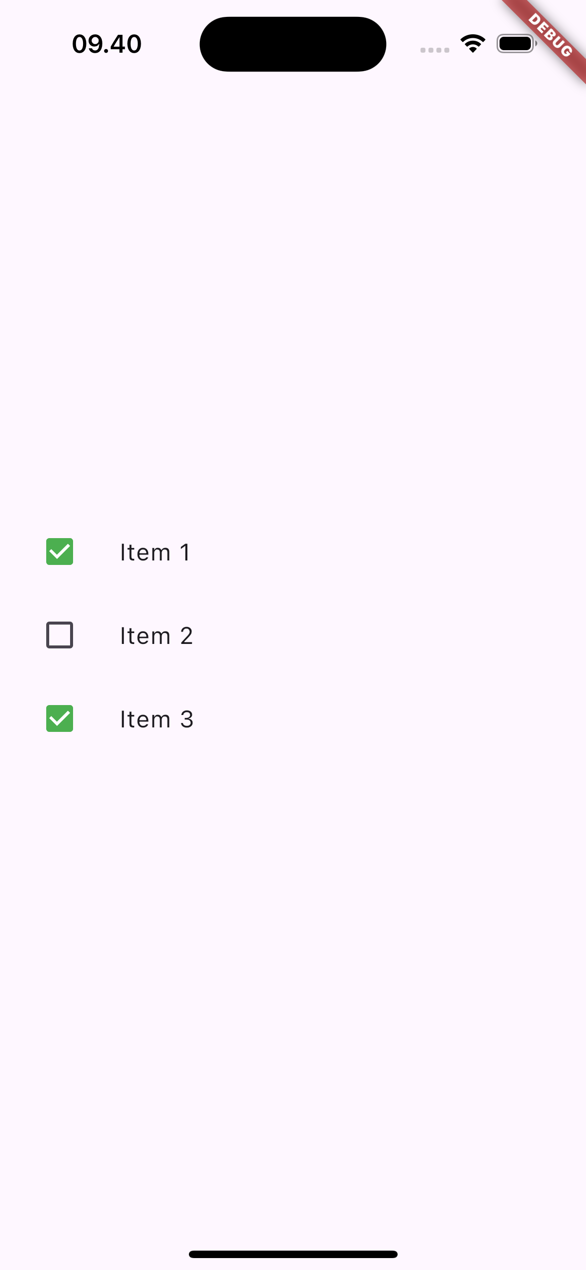
CheckboxComponent<String>(
items: ['Item 1', 'Item 2', 'Item 3'], // Dynamic list of checkboxes
selectedValues: _selectedItems, // Currently selected checkboxes
onChanged: (List<String> values) {
setState(() {
_selectedItems = values;
});
},
labelBuilder: (item) => Text(item), // Labels for each checkbox
activeColor: Colors.green, // Active checkbox color
checkColor: Colors.white, // Checkmark color
),
],
),
),
),
);
}
}
¶ Properties
¶ 1. items
A list of items that will generate the checkboxes dynamically. Each item represents an individual checkbox.
CheckboxComponent<String>(
  items: ['Item 1', 'Item 2', 'Item 3'],
  selectedValues: _selectedItems,
  onChanged: (List<String> values) {
    setState(() {
      _selectedItems = values;
    });
  },
  labelBuilder: (item) => Text(item),
)
¶ 2. selectedValues
The currently selected values (checked items). This list keeps track of which items are checked.
CheckboxComponent<String>(
  items: ['Item 1', 'Item 2'],
  selectedValues: _selectedItems, // The currently selected items
  onChanged: (List<String> values) {
    setState(() {
      _selectedItems = values;
    });
  },
)
¶ 3. onChanged
A callback that is triggered whenever the user checks or unchecks a checkbox. It passes the updated list of selected values.
CheckboxComponent<String>(
  items: ['Item 1', 'Item 2'],
  selectedValues: _selectedItems,
  onChanged: (List<String> values) {
    setState(() {
      _selectedItems = values;
    });
  },
)
¶ 4. labelBuilder
A function that generates the label for each checkbox. It takes the item and returns a widget (usually a Text widget) that serves as the label for the checkbox.
CheckboxComponent<String>(
  items: ['Item 1', 'Item 2'],
  selectedValues: _selectedItems,
  labelBuilder: (item) => Text(item), // Labels for checkboxes
)
¶ 5. activeColor
The color of the checkbox when it is checked.
CheckboxComponent<String>(
  items: ['Item 1', 'Item 2'],
  selectedValues: _selectedItems,
  activeColor: Colors.green, // Change active color
  onChanged: (List<String> values) {
    setState(() {
      _selectedItems = values;
    });
  },
)
¶ 6. checkColor
The color of the check mark inside the checkbox.
CheckboxComponent<String>(
  items: ['Item 1', 'Item 2'],
  selectedValues: _selectedItems,
  checkColor: Colors.white, // Change check mark color
  onChanged: (List<String> values) {
    setState(() {
      _selectedItems = values;
    });
  },
)
¶ 7. tristate
If true, the checkbox can have three states: true, false, and null. This is useful for partially selected or indeterminate states.
CheckboxComponent<String>(
  items: ['Item 1', 'Item 2'],
  selectedValues: _selectedItems,
  tristate: true, // Enable three states
  onChanged: (List<String> values) {
    setState(() {
      _selectedItems = values;
    });
  },
)
¶ 8. isSelected
A custom function to control the selection state of each checkbox. This allows you to programmatically determine whether a checkbox is checked.
CheckboxComponent<String>(
  items: ['Item 1', 'Item 2'],
  selectedValues: _selectedItems,
  isSelected: (item) => item == 'Item 2', // Custom selection logic
  onChanged: (List<String> values) {
    setState(() {
      _selectedItems = values;
    });
  },
)