The Chip widget in Flutter is a compact component that represents an entity, attribute, or action. Chips can contain text, an optional leading icon (called avatar), and an optional trailing delete button (deleteIcon). Chips are commonly used for displaying categories, tags, or choices in a concise, interactive manner. They can be selected, deleted, or have other actions associated with them.
¶ Component
import 'package:flutter/material.dart';

class ChipComponent<T> extends StatelessWidget {
  final List<T> items; // List of dynamic items to generate chips
  final String Function(T) labelBuilder; // Function to build the label for each chip
  final Widget Function(T)? avatarBuilder; // Function to build avatars for each chip (optional)
  final bool Function(T)? isSelected; // Function to determine if a chip is selected
  final ValueChanged<T>? onSelected; // Callback when a chip is selected or deselected
  final ValueChanged<T>? onDeleted; // Callback when the delete button is pressed
  final Color? selectedColor; // Background color for selected chips
  final Color? unselectedColor; // Background color for unselected chips

  const ChipComponent({
    Key? key,
    required this.items,
    required this.labelBuilder,
    this.avatarBuilder,
    this.isSelected,
    this.onSelected,
    this.onDeleted,
    this.selectedColor,
    this.unselectedColor,
  }) : super(key: key);

  @override
  Widget build(BuildContext context) {
    return Wrap(
      spacing: 8.0, // Spacing between chips
      runSpacing: 8.0, // Spacing between lines of chips
      children: items.map((item) {
        bool selected = isSelected != null ? isSelected!(item) : false;

        return ChoiceChip(
          label: Text(labelBuilder(item)),
          avatar: avatarBuilder != null ? avatarBuilder!(item) : null,
          selected: selected,
          onSelected: onSelected != null
              ? (bool isSelected) => onSelected!(item)
              : null,
          deleteIcon: onDeleted != null ? Icon(Icons.cancel) : null,
          onDeleted: onDeleted != null ? () => onDeleted!(item) : null,
          selectedColor: selectedColor ?? Theme.of(context).chipTheme.selectedColor,
          backgroundColor: unselectedColor ?? Theme.of(context).chipTheme.backgroundColor,
        );
      }).toList(),
    );
  }
}¶ How to Use
import 'package:flutter/material.dart';
import 'chip_component.dart'; // Import renamed ChipComponent
void main() {
runApp(MyApp());
}
class MyApp extends StatefulWidget {
@override
_MyAppState createState() => _MyAppState();
}
class _MyAppState extends State<MyApp> {
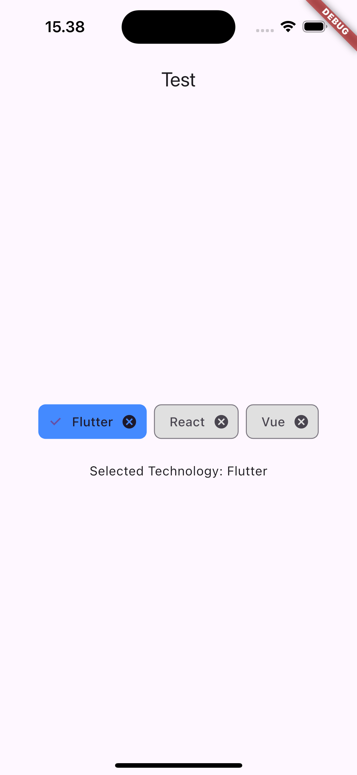
List<String> technologies = ['Flutter', 'React', 'Vue'];
String selectedTechnology = '';
@override
Widget build(BuildContext context) {
return MaterialApp(
home: Scaffold(
appBar: AppBar(
title: Text('Dynamic Chip Component Example'),
),
body: Center(
child: Column(
mainAxisAlignment: MainAxisAlignment.center,
children: [
ChipComponent<String>(
items: technologies,
labelBuilder: (item) => item,
isSelected: (item) => item == selectedTechnology,
onSelected: (item) {
setState(() {
selectedTechnology = item;
});
print('$item selected');
},
onDeleted: (item) {
setState(() {
technologies.remove(item);
});
print('$item deleted');
},
selectedColor: Colors.blueAccent,
unselectedColor: Colors.grey.shade300,
),
SizedBox(height: 20),
Text('Selected Technology: $selectedTechnology'),
],
),
),
),
);
}
}
¶ Properties
¶ 1. items
A list of items that will dynamically generate chips.
ChipComponent<String>(
  items: ['Flutter', 'React', 'Vue'],
  labelBuilder: (item) => item,
)
¶ 2. labelBuilder
A function to dynamically build the label for each chip.
ChipComponent<String>(
  items: ['Flutter', 'React', 'Vue'],
  labelBuilder: (item) => item,
)
¶ 3. avatarBuilder
An optional function that builds an avatar (such as an icon or image) for each chip.
ChipComponent<String>(
  items: ['Flutter', 'React', 'Vue'],
  labelBuilder: (item) => item,
  avatarBuilder: (item) => CircleAvatar(child: Text(item[0])), // Avatar based on the first letter
)
¶ 4. isSelected
A function that determines whether a particular chip is selected or not.
ChipComponent<String>(
  items: ['Flutter', 'React', 'Vue'],
  labelBuilder: (item) => item,
  isSelected: (item) => item == 'Flutter', // Flutter chip is selected
)
¶ 5. onSelected
A callback that is triggered when a chip is selected or deselected.
ChipComponent<String>(
  items: ['Flutter', 'React', 'Vue'],
  labelBuilder: (item) => item,
  onSelected: (item) {
    print('$item selected');
  },
)
¶ 6. onDeleted
A callback that is triggered when the delete icon is pressed.
ChipComponent<String>(
  items: ['Flutter', 'React', 'Vue'],
  labelBuilder: (item) => item,
  onDeleted: (item) {
    print('$item deleted');
  },
)
¶ 7. selectedColor
The background color for selected chips.
ChipComponent<String>(
  items: ['Flutter', 'React', 'Vue'],
  labelBuilder: (item) => item,
  selectedColor: Colors.blue, // Blue background for selected chips
)
¶ 8. unselectedColor
The background color for unselected chips.
ChipComponent<String>(
  items: ['Flutter', 'React', 'Vue'],
  labelBuilder: (item) => item,
  unselectedColor: Colors.grey.shade200, // Grey background for unselected chips
)