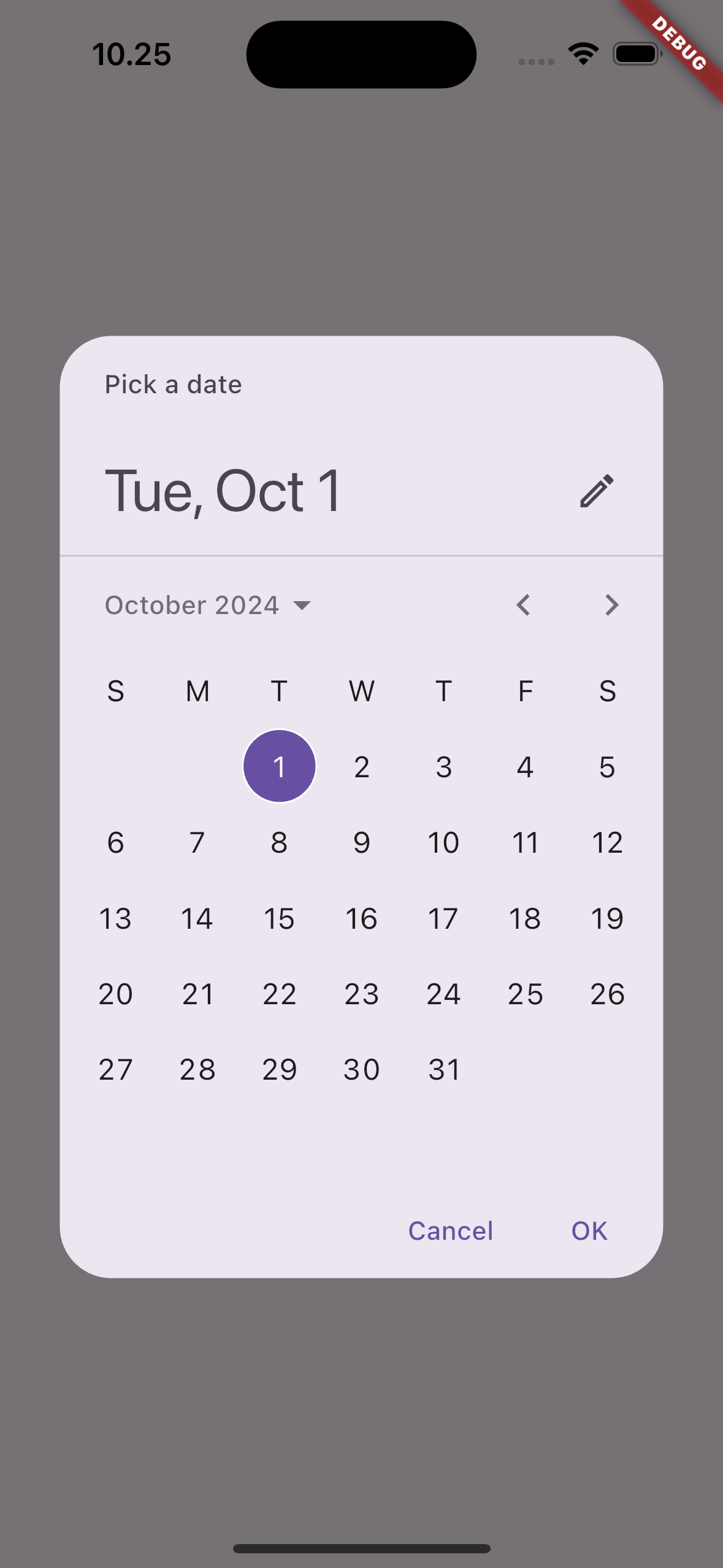
The showDatePicker function in Flutter allows users to select a date from a visual calendar. This function displays a Material Design date picker dialog and returns the selected date. It is typically used in forms where users need to pick a specific date, such as in booking apps, event management systems, or scheduling features.
¶ Component
import 'package:flutter/material.dart';

class DatePickerComponent extends StatelessWidget {
  final DateTime initialDate; // The initially selected date
  final DateTime firstDate; // The earliest selectable date
  final DateTime lastDate; // The latest selectable date
  final Function(DateTime?) onDateSelected; // Callback to handle the selected date
  final DatePickerEntryMode entryMode; // Defines the entry mode (calendar or input)
  final Locale? locale; // Defines the locale for the date picker
  final String? helpText; // Help text shown at the top of the picker
  final String? cancelText; // Custom cancel button text
  final String? confirmText; // Custom confirm button text
  final DatePickerMode initialDatePickerMode; // Initial display (calendar or year)
  final TextDirection? textDirection; // Custom text direction
  final bool useRootNavigator; // Whether to use the root navigator

  const DatePickerComponent({
    super.key,
    required this.initialDate,
    required this.firstDate,
    required this.lastDate,
    required this.onDateSelected,
    this.entryMode = DatePickerEntryMode.calendar,
    this.locale,
    this.helpText,
    this.cancelText,
    this.confirmText,
    this.initialDatePickerMode = DatePickerMode.day,
    this.textDirection,
    this.useRootNavigator = true,
  });

  Future<void> _showDatePicker(BuildContext context) async {
    final DateTime? pickedDate = await showDatePicker(
      context: context,
      initialDate: initialDate,
      firstDate: firstDate,
      lastDate: lastDate,
      initialEntryMode: entryMode,
      locale: locale,
      helpText: helpText,
      cancelText: cancelText,
      confirmText: confirmText,
      initialDatePickerMode: initialDatePickerMode,
      textDirection: textDirection,
      useRootNavigator: useRootNavigator,
    );

    if (pickedDate != null) {
      onDateSelected(pickedDate);
    }
  }

  @override
  Widget build(BuildContext context) {
    return ElevatedButton(
      onPressed: () => _showDatePicker(context),
      child: Text('Select Date'),
    );
  }
}¶ How to Use
import 'package:flutter/material.dart';
import 'date_picker_component.dart';
void main() {
runApp(MyApp());
}
class MyApp extends StatefulWidget {
@override
_MyAppState createState() => _MyAppState();
}
class _MyAppState extends State<MyApp> {
DateTime? _selectedDate;
@override
Widget build(BuildContext context) {
return MaterialApp(
home: Scaffold(
appBar: AppBar(title: Text('DatePicker Component Example')),
body: Center(
child: Column(
mainAxisAlignment: MainAxisAlignment.center,
children: [
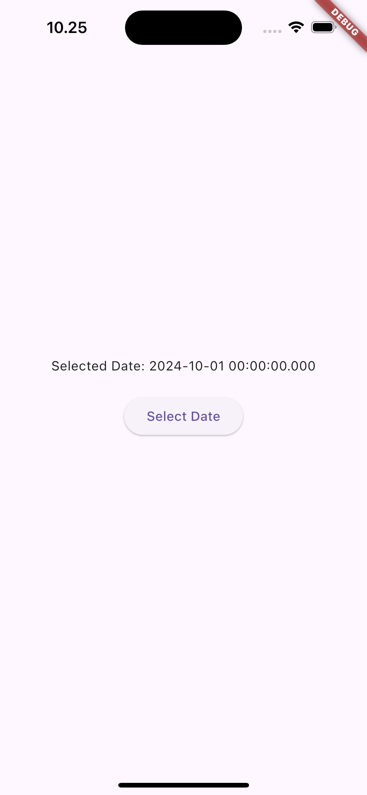
Text(_selectedDate != null ? 'Selected Date: ${_selectedDate!.toLocal()}' : 'No date selected'),
SizedBox(height: 20),
DatePickerComponent(
initialDate: DateTime.now(),
firstDate: DateTime(2000),
lastDate: DateTime(2100),
helpText: 'Pick a date',
onDateSelected: (DateTime? date) {
setState(() {
_selectedDate = date;
});
},
),
],
),
),
),
);
}
}
 |
 |
 |
¶ Properties
¶ 1. initialDate
The initially selected date when the date picker opens.
DatePickerComponent(
  initialDate: DateTime.now(), // Starts with the current date
  firstDate: DateTime(2000),   // Earliest date that can be selected
  lastDate: DateTime(2100),    // Latest date that can be selected
  onDateSelected: (DateTime? date) {
    print("Selected Date: $date");
  },
)
¶ 2. firstDate
The earliest date that can be selected in the picker. This ensures users cannot pick a date earlier than this.
DatePickerComponent(
  initialDate: DateTime.now(),
  firstDate: DateTime(2000),   // Earliest selectable date
  lastDate: DateTime(2100),
  onDateSelected: (DateTime? date) {
    print("Selected Date: $date");
  },
)
¶ 3. lastDate
The latest date that can be selected in the picker. Users cannot pick a date beyond this.
DatePickerComponent(
  initialDate: DateTime.now(),
  firstDate: DateTime(2000),
  lastDate: DateTime(2100),    // Latest selectable date
  onDateSelected: (DateTime? date) {
    print("Selected Date: $date");
  },
)
¶ 4. onDateSelected
A callback function that is triggered when the user selects a date. The selected date is passed to this function for further processing.
DatePickerComponent(
  initialDate: DateTime.now(),
  firstDate: DateTime(2000),
  lastDate: DateTime(2100),
  onDateSelected: (DateTime? date) {
    if (date != null) {
      print("Selected Date: $date");
    }
  },
)
¶ 5. entryMode
Defines whether the user initially selects the date from a calendar view or an input field. Options are:
DatePickerEntryMode.calendar(default)DatePickerEntryMode.input
DatePickerComponent(
  initialDate: DateTime.now(),
  firstDate: DateTime(2000),
  lastDate: DateTime(2100),
  entryMode: DatePickerEntryMode.input,  // Users can enter the date manually
  onDateSelected: (DateTime? date) {
    print("Selected Date: $date");
  },
)
¶ 6. locale
Specifies the locale to use for date formatting. This is useful for localization of the date picker. If not set, the system's locale is used.
DatePickerComponent(
  initialDate: DateTime.now(),
  firstDate: DateTime(2000),
  lastDate: DateTime(2100),
  locale: Locale('en', 'US'),  // U.S. English locale
  onDateSelected: (DateTime? date) {
    print("Selected Date: $date");
  },
)
¶ 7. helpText
The text displayed at the top of the date picker dialog to guide the user.
DatePickerComponent(
  initialDate: DateTime.now(),
  firstDate: DateTime(2000),
  lastDate: DateTime(2100),
  helpText: 'Select Your Birthday', // Custom help text
  onDateSelected: (DateTime? date) {
    print("Selected Date: $date");
  },
)
¶ 8. cancelText
The text for the cancel button. If not set, it defaults to "Cancel".
DatePickerComponent(
  initialDate: DateTime.now(),
  firstDate: DateTime(2000),
  lastDate: DateTime(2100),
  cancelText: 'Abort', // Custom cancel button text
  onDateSelected: (DateTime? date) {
    print("Selected Date: $date");
  },
)
¶ 9. confirmText
The text for the confirm button. If not set, it defaults to "OK".
DatePickerComponent(
  initialDate: DateTime.now(),
  firstDate: DateTime(2000),
  lastDate: DateTime(2100),
  confirmText: 'Confirm Date', // Custom confirm button text
  onDateSelected: (DateTime? date) {
    print("Selected Date: $date");
  },
)
¶ 10. initialDatePickerMode
Specifies whether the date picker opens with the day view or the year view. Useful for selecting dates far in the past or future.
DatePickerComponent(
  initialDate: DateTime.now(),
  firstDate: DateTime(2000),
  lastDate: DateTime(2100),
  initialDatePickerMode: DatePickerMode.year, // Open with year selection
  onDateSelected: (DateTime? date) {
    print("Selected Date: $date");
  },
)
¶ 11. textDirection
Defines the direction in which text is displayed in the date picker (left-to-right or right-to-left).
DatePickerComponent(
  initialDate: DateTime.now(),
  firstDate: DateTime(2000),
  lastDate: DateTime(2100),
  textDirection: TextDirection.rtl, // Right-to-left text direction
  onDateSelected: (DateTime? date) {
    print("Selected Date: $date");
  },
)
¶ 12. useRootNavigator
Specifies whether to use the root navigator for displaying the date picker. Typically set to false in nested navigators.
DatePickerComponent(
  initialDate: DateTime.now(),
  firstDate: DateTime(2000),
  lastDate: DateTime(2100),
  useRootNavigator: false, // Use nested navigator
  onDateSelected: (DateTime? date) {
    print("Selected Date: $date");
  },
)