The Dialog widget in Flutter is a modal window that interrupts the user's workflow to communicate urgent information or require a decision. It is typically used for alerts, confirmations, or prompting the user to take action. A dialog can display a title, content (such as text or images), and actions like buttons for confirmation or dismissal. Dialogs can also be customized with shapes, background colors, and elevation.
¶ Component
import 'package:flutter/material.dart';

class DialogComponent extends StatelessWidget {
  final Widget? title; // Title of the dialog
  final Widget? content; // Main content inside the dialog
  final List<Widget>? actions; // Action buttons (e.g., OK, Cancel)
  final ShapeBorder? shape; // Shape of the dialog box (e.g., RoundedRectangle)
  final Color? backgroundColor; // Background color of the dialog
  final double? elevation; // Elevation of the dialog (shadow)
  final bool barrierDismissible; // Whether the dialog can be dismissed by tapping outside
  final String? barrierLabel; // Label for accessibility when the barrier is shown
  final Color? barrierColor; // Color of the background overlay outside the dialog
  final EdgeInsets? insetPadding; // Padding around the dialog
  final bool useSafeArea; // Whether the dialog should avoid system UI elements
  final Widget? icon; // Icon to show at the top of the dialog

  const DialogComponent({
    Key? key,
    this.title,
    this.content,
    this.actions,
    this.shape,
    this.backgroundColor,
    this.elevation,
    this.barrierDismissible = true,
    this.barrierLabel,
    this.barrierColor,
    this.insetPadding = const EdgeInsets.all(16.0),
    this.useSafeArea = true,
    this.icon,
  }) : super(key: key);

  @override
  Widget build(BuildContext context) {
    return Dialog(
      shape: shape,
      backgroundColor: backgroundColor,
      elevation: elevation,
      insetPadding: insetPadding,
      child: Padding(
        padding: const EdgeInsets.all(16.0),
        child: Column(
          mainAxisSize: MainAxisSize.min,
          children: [
            if (icon != null) ...[
              icon!,
              SizedBox(height: 16),
            ],
            if (title != null) ...[
              DefaultTextStyle(
                style: Theme.of(context).textTheme.headlineMedium!,
                child: title!,
              ),
              SizedBox(height: 16),
            ],
            if (content != null) ...[
              content!,
              SizedBox(height: 24),
            ],
            if (actions != null)
              Row(
                mainAxisAlignment: MainAxisAlignment.end,
                children: actions!,
              ),
          ],
        ),
      ),
    );
  }
}¶ How to Use
import 'package:flutter/material.dart';
import 'package:flutter_aigs_sdk/widgets/button/elevated_button_component.dart';
import 'package:flutter_aigs_sdk/widgets/dialog/dialog_component.dart';
void main() {
runApp(const MainApp());
}
class MainApp extends StatelessWidget {
const MainApp({super.key});
@override
Widget build(BuildContext context) {
return MaterialApp(
home: TestView(),
);
}
}
class TestView extends StatelessWidget {
@override
Widget build(BuildContext context) {
return Scaffold(
appBar: AppBar(title: Text("Test")),
body: Container(
child: Center(
child: ElevatedButtonComponent(
onPressed: () {
showDialog(
context: context,
barrierDismissible: false, // Dismiss dialog on outside tap
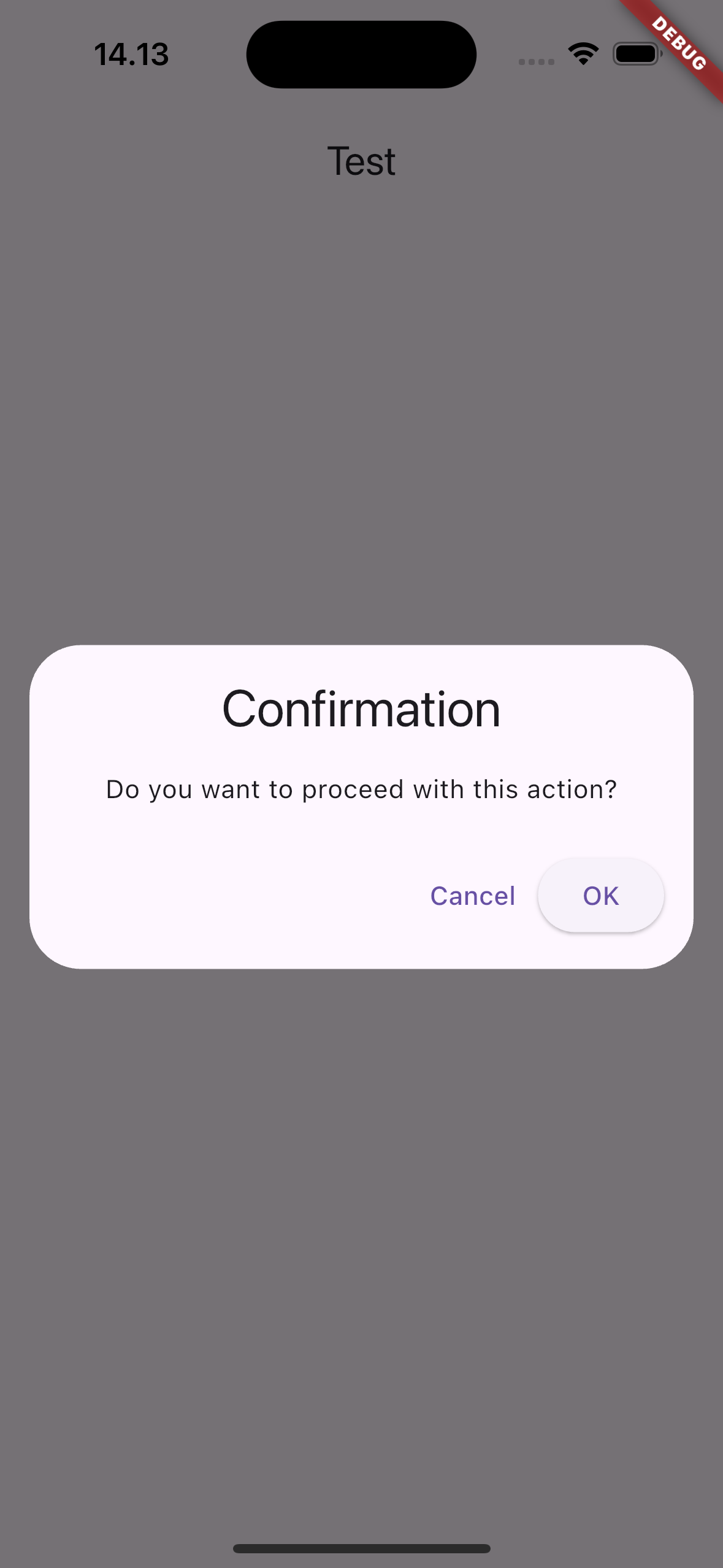
builder: (BuildContext context) {
return DialogComponent(
title: Text('Confirmation'),
content: Text('Do you want to proceed with this action?'),
actions: [
TextButton(
onPressed: () => Navigator.of(context).pop(),
child: Text('Cancel'),
),
ElevatedButton(
onPressed: () {
print('Confirmed');
Navigator.of(context).pop();
},
child: Text('OK'),
),
],
);
},
);
},
child: Text("PressMe"),
),
),
),
);
}
}
¶ Properties
¶ 1. title
The title displayed at the top of the dialog. Typically a Text widget.
DialogComponent(
  title: Text('Dialog Title'), // Title of the dialog
  content: Text('This is a sample dialog content'),
  actions: [
    TextButton(
      onPressed: () => Navigator.of(context).pop(),
      child: Text('OK'),
    ),
  ],
)
¶ 2. content
The main content displayed in the dialog. It can contain text, images, forms, or any other widget.
DialogComponent(
  title: Text('Dialog Title'),
  content: Text('This is the content of the dialog.'), // Main content
)
¶ 3. actions
A list of action buttons displayed at the bottom of the dialog (e.g., OK, Cancel). Typically TextButton or ElevatedButton.
DialogComponent(
  title: Text('Dialog Title'),
  content: Text('Do you want to proceed?'),
  actions: [
    TextButton(
      onPressed: () => Navigator.of(context).pop(),
      child: Text('Cancel'),
    ),
    ElevatedButton(
      onPressed: () {
        print('Confirmed');
        Navigator.of(context).pop();
      },
      child: Text('OK'),
    ),
  ],
)
¶ 4. shape
Defines the shape of the dialog, such as rounded corners or custom edges.
DialogComponent(
  title: Text('Dialog Title'),
  content: Text('This is a rounded dialog.'),
  shape: RoundedRectangleBorder(
    borderRadius: BorderRadius.circular(20),
  ), // Rounded corners for the dialog
)
¶ 5. backgroundColor
The background color of the dialog. If not specified, it defaults to the theme's dialog background color.
DialogComponent(
  title: Text('Dialog Title'),
  content: Text('This dialog has a custom background color.'),
  backgroundColor: Colors.white, // Custom background color
)
¶ 6. elevation
Controls the elevation (shadow) of the dialog. A higher elevation creates a more prominent shadow.
DialogComponent(
  title: Text('Dialog Title'),
  content: Text('This dialog has a custom elevation.'),
  elevation: 10.0, // Custom shadow elevation
)
¶ 7. barrierDismissible
Determines whether tapping outside the dialog dismisses it. If false, the user must interact with the dialog buttons to close it.
DialogComponent(
  title: Text('Non-dismissable Dialog'),
  content: Text('You must click OK or Cancel to close this dialog.'),
  barrierDismissible: false, // Prevent dismissal by tapping outside
)
¶ 8. barrierColor
The color of the background overlay behind the dialog.
DialogComponent(
  title: Text('Dialog Title'),
  content: Text('This dialog has a custom barrier color.'),
  barrierColor: Colors.black.withOpacity(0.5), // Semi-transparent overlay
)
¶ 9. barrierLabel
The label used for accessibility when the barrier is shown. This helps screen readers describe the purpose of the barrier to users with disabilities.
DialogComponent(
  title: Text('Dialog Title'),
  content: Text('This dialog has an accessible barrier label.'),
  barrierLabel: 'Close this dialog', // For accessibility
)
¶ 10. insetPadding
The padding around the dialog. It controls how much space surrounds the dialog on the screen.
DialogComponent(
  title: Text('Dialog Title'),
  content: Text('This dialog has custom inset padding.'),
  insetPadding: EdgeInsets.symmetric(horizontal: 32.0), // Custom padding around dialog
)
¶ 11. useSafeArea
Whether the dialog should avoid system UI elements like the status bar, the navigation bar, and the notch.
DialogComponent(
  title: Text('Dialog Title'),
  content: Text('This dialog uses safe area.'),
  useSafeArea: false, // The dialog can overlap system UI elements
)
¶ 12. icon
An optional icon to display at the top of the dialog. It can be an image, icon, or any widget.
DialogComponent(
  title: Text('Dialog Title'),
  content: Text('This dialog has an icon at the top.'),
  icon: Icon(Icons.warning, size: 50, color: Colors.red), // Display icon in the dialog
)