The DropdownButton widget in Flutter is a material design widget that allows users to select an item from a list of options. It is often used when there are a limited number of choices, and the selection of one option should trigger some action or update the UI. The DropdownButton expands to show all available options when tapped and collapses after an option is selected.
¶ Component
import 'package:flutter/material.dart';

class DropdownComponent<T> extends StatelessWidget {
  final List<T> items; // List of dynamic items to be converted into dropdown menu items
  final T? value; // The currently selected value
  final ValueChanged<T?> onChanged; // Callback when an item is selected
  final String Function(T) itemLabelBuilder; // Function to build the label for each item
  final Widget? hint; // Placeholder text before an item is selected
  final TextStyle? style; // Text style for dropdown items
  final Color? dropdownColor; // Background color of the dropdown menu
  final bool isExpanded; // Whether the dropdown should fill the parent width
  final double? iconSize; // Size of the dropdown icon
  final Widget? icon; // Custom dropdown icon
  final Color? iconEnabledColor; // Color of the dropdown icon when enabled
  final Color? iconDisabledColor; // Color of the dropdown icon when disabled
  final double? elevation; // Elevation of the dropdown menu
  final EdgeInsetsGeometry? padding; // Padding around the dropdown button

  const DropdownComponent({
    Key? key,
    required this.items,
    required this.onChanged,
    required this.itemLabelBuilder,
    this.value,
    this.hint,
    this.style,
    this.dropdownColor,
    this.isExpanded = false,
    this.iconSize,
    this.icon,
    this.iconEnabledColor,
    this.iconDisabledColor,
    this.elevation,
    this.padding,
  }) : super(key: key);

  @override
  Widget build(BuildContext context) {
    return Padding(
      padding: padding ?? EdgeInsets.all(0),
      child: DropdownButton<T>(
        items: items.map((T item) {
          return DropdownMenuItem<T>(
            value: item,
            child: Text(itemLabelBuilder(item)),
          );
        }).toList(),
        value: value,
        onChanged: onChanged,
        hint: hint,
        style: style,
        dropdownColor: dropdownColor,
        isExpanded: isExpanded,
        iconSize: iconSize ?? 24.0,
        icon: icon,
        iconEnabledColor: iconEnabledColor,
        iconDisabledColor: iconDisabledColor,
        elevation: elevation?.toInt() ?? 8,
      ),
    );
  }
}¶ How to Use
import 'package:flutter/material.dart';
import 'package:flutter_aigs_sdk/widgets/dropdown/dropdown_component.dart';
void main() {
runApp(const MainApp());
}
class MainApp extends StatelessWidget {
const MainApp({super.key});
@override
Widget build(BuildContext context) {
return const MaterialApp(
home: TestView(),
);
}
}
class TestView extends StatefulWidget {
const TestView({super.key});
@override
State<TestView> createState() => _TestViewState();
}
class _TestViewState extends State<TestView> {
String? selectedValue;
List<String> dynamicItems = ['Flutter', 'React', 'Vue'];
@override
Widget build(BuildContext context) {
return Scaffold(
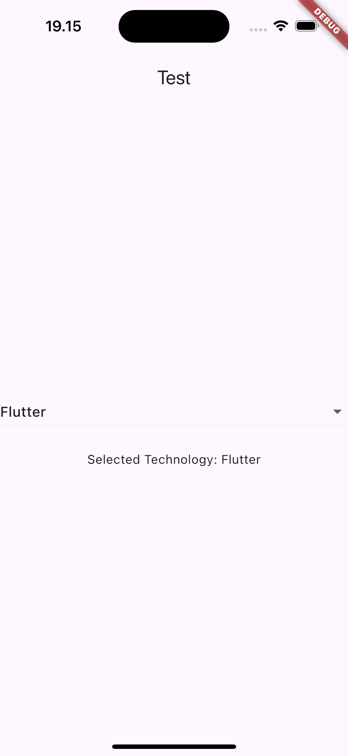
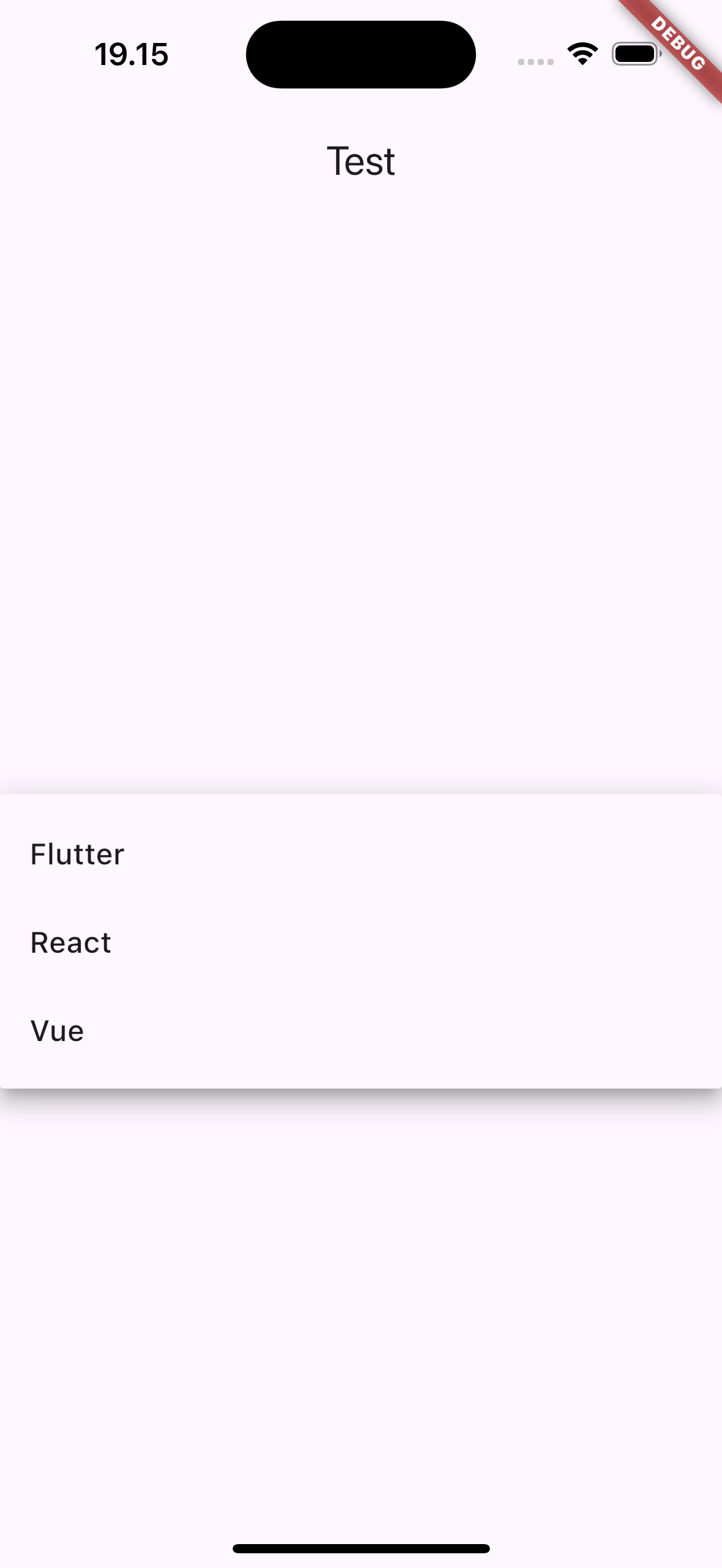
appBar: AppBar(title: const Text("Test")),
body: Container(
child: Center(
child: Column(
mainAxisAlignment: MainAxisAlignment.center,
children: [
DropdownComponent<String>(
items: dynamicItems,
itemLabelBuilder: (item) =>
item, // Use the string itself as the label
value: selectedValue,
hint: const Text('Select a framework'),
onChanged: (value) {
setState(() {
selectedValue = value;
});
print('Selected value: $value');
},
isExpanded: true,
),
const SizedBox(height: 20),
Text('Selected Technology: $selectedValue'),
],
),
),
),
);
}
}
 |
 |
¶ Properties
¶ 1. items
A dynamic list of items that will be displayed in the dropdown. These can be any type of data (e.g., String, int, custom objects). You will convert each item into a DropdownMenuItem<T> using the itemLabelBuilder function.
DropdownComponent<String>(
  items: ['Apple', 'Banana', 'Cherry'], // Dynamic list of strings
  itemLabelBuilder: (item) => item, // Label is simply the string value
  onChanged: (value) {
    print(value);
  },
)
¶ 2. value
The currently selected value in the dropdown. This must match one of the values provided in the items list.
DropdownComponent<String>(
  items: ['Apple', 'Banana', 'Cherry'],
  value: 'Apple', // Preselect the 'Apple' item
  itemLabelBuilder: (item) => item,
  onChanged: (value) {
    print(value);
  },
)
¶ 3. onChanged
A callback function that is triggered whenever the user selects an item from the dropdown. The selected value is passed to this function.
DropdownComponent<String>(
  items: ['Apple', 'Banana', 'Cherry'],
  itemLabelBuilder: (item) => item,
  onChanged: (value) {
    print('Selected value: $value'); // Do something when an item is selected
  },
)
¶ 4. itemLabelBuilder
A function that builds the label (the text) for each dropdown item. This function maps each item from the items list to a displayable string. It is useful when you want to convert objects into readable text.
DropdownComponent<String>(
  items: ['Apple', 'Banana', 'Cherry'],
  itemLabelBuilder: (item) => 'Fruit: $item', // Customize the label
  onChanged: (value) {
    print(value);
  },
)
¶ 5. hint
A placeholder widget that is displayed when no item is selected. This is useful for showing instructions or a prompt before selection.
DropdownComponent<String>(
  items: ['Apple', 'Banana', 'Cherry'],
  itemLabelBuilder: (item) => item,
  hint: Text('Select a fruit'), // Placeholder text
  onChanged: (value) {
    print(value);
  },
)
¶ 6. style
The text style for the dropdown items and the currently selected value. You can customize the font size, color, weight, etc.
DropdownComponent<String>(
  items: ['Apple', 'Banana', 'Cherry'],
  itemLabelBuilder: (item) => item,
  style: TextStyle(fontSize: 18, color: Colors.blue), // Custom style
  onChanged: (value) {
    print(value);
  },
)
¶ 7. dropdownColor
The background color of the dropdown menu when it is open.
DropdownComponent<String>(
  items: ['Apple', 'Banana', 'Cherry'],
  itemLabelBuilder: (item) => item,
  dropdownColor: Colors.lightBlueAccent, // Custom background color
  onChanged: (value) {
    print(value);
  },
)
¶ 8. isExpanded
If true, the dropdown will fill the width of its parent. Otherwise, the dropdown will only take up as much space as needed to display the currently selected value and the icon.
DropdownComponent<String>(
  items: ['Apple', 'Banana', 'Cherry'],
  itemLabelBuilder: (item) => item,
  isExpanded: true, // Dropdown will expand to the parent width
  onChanged: (value) {
    print(value);
  },
)
¶ 9. iconSize
The size of the dropdown icon (default is 24.0).
DropdownComponent<String>(
  items: ['Apple', 'Banana', 'Cherry'],
  itemLabelBuilder: (item) => item,
  iconSize: 30.0, // Custom icon size
  onChanged: (value) {
    print(value);
  },
)
¶ 10. icon
A custom widget to replace the default dropdown arrow icon. If not provided, the default down arrow is used.
DropdownComponent<String>(
  items: ['Apple', 'Banana', 'Cherry'],
  itemLabelBuilder: (item) => item,
  icon: Icon(Icons.arrow_drop_down_circle), // Custom dropdown icon
  onChanged: (value) {
    print(value);
  },
)
¶ 11. iconEnabledColor and iconDisabledColor
The color of the dropdown icon when it is enabled or disabled.
DropdownComponent<String>(
  items: ['Apple', 'Banana', 'Cherry'],
  itemLabelBuilder: (item) => item,
  iconEnabledColor: Colors.green, // Color when enabled
  iconDisabledColor: Colors.red, // Color when disabled
  onChanged: (value) {
    print(value);
  },
)
¶ 12. elevation
The elevation (shadow) of the dropdown menu. The default elevation is 8.
DropdownComponent<String>(
  items: ['Apple', 'Banana', 'Cherry'],
  itemLabelBuilder: (item) => item,
  elevation: 12.0, // Higher shadow
  onChanged: (value) {
    print(value);
  },
)
¶ 13. padding
Padding around the dropdown button. It controls the space around the text and icon inside the dropdown.
DropdownComponent<String>(
  items: ['Apple', 'Banana', 'Cherry'],
  itemLabelBuilder: (item) => item,
  padding: EdgeInsets.symmetric(horizontal: 16.0),
  onChanged: (value) {
    print(value);
  },
)