The FloatingActionButton (FAB) in Flutter is a circular button that hovers above the UI and is primarily used for the most important action on a screen. It typically appears in the bottom-right corner of the screen and often includes an icon to visually represent the action. The FAB is designed as a prominent UI element, drawing attention to an action that users are encouraged to take.
¶ Component
import 'package:flutter/material.dart';

class FloatingActionButtonComponent extends StatelessWidget {
  final VoidCallback onPressed; // Action when FAB is pressed
  final Widget child; // Icon or text inside the FAB
  final Color? backgroundColor; // Background color of the FAB
  final Color? foregroundColor; // Color of the icon/text inside the FAB
  final String? tooltip; // Tooltip shown when the user long presses on the FAB
  final double? elevation; // Elevation (shadow) of the FAB
  final ShapeBorder? shape; // Shape of the FAB
  final bool isExtended; // Determines if the FAB should be extended with text
  final double? hoverElevation; // Elevation of FAB when hovered (for web)
  final double? focusElevation; // Elevation of FAB when focused
  final double? disabledElevation; // Elevation when FAB is disabled
  final bool autofocus; // Determines if the FAB should auto-focus

  const FloatingActionButtonComponent({
    Key? key,
    required this.onPressed,
    required this.child,
    this.backgroundColor,
    this.foregroundColor,
    this.tooltip,
    this.elevation,
    this.shape,
    this.isExtended = false,
    this.hoverElevation,
    this.focusElevation,
    this.disabledElevation,
    this.autofocus = false,
  }) : super(key: key);

  @override
  Widget build(BuildContext context) {
    return isExtended
        ? FloatingActionButton.extended(
            onPressed: onPressed,
            backgroundColor: backgroundColor,
            foregroundColor: foregroundColor,
            tooltip: tooltip,
            elevation: elevation,
            hoverElevation: hoverElevation,
            focusElevation: focusElevation,
            disabledElevation: disabledElevation,
            autofocus: autofocus,
            shape: shape,
            label: child, // Use label for extended FAB
          )
        : FloatingActionButton(
            onPressed: onPressed,
            child: child,
            backgroundColor: backgroundColor,
            foregroundColor: foregroundColor,
            tooltip: tooltip,
            elevation: elevation,
            hoverElevation: hoverElevation,
            focusElevation: focusElevation,
            disabledElevation: disabledElevation,
            autofocus: autofocus,
            shape: shape,
          );
  }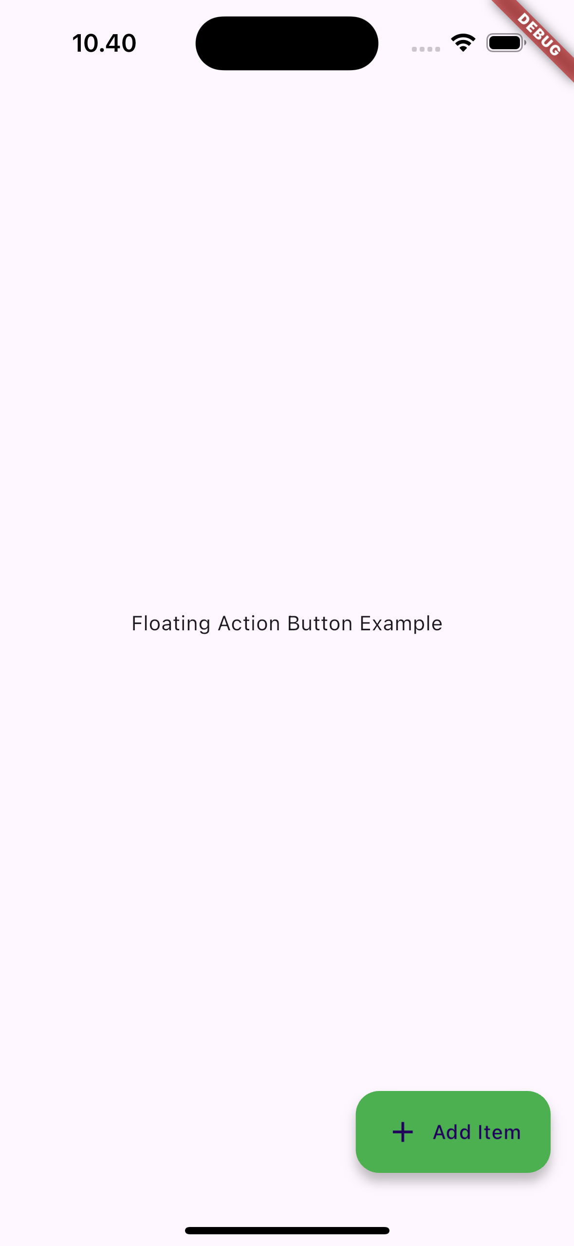
}¶ How to Use
 |
 |
¶ Properties
¶ 1. onPressed
A required callback that is triggered when the FAB is tapped. If this is null, the FAB will be disabled.
FloatingActionButtonComponent(
  onPressed: () {
    print('FAB Pressed');
  },
  child: Icon(Icons.add),
)
¶ 2. child
The content inside the FAB, typically an Icon or Text widget. This represents the action visually.
FloatingActionButtonComponent(
  onPressed: () {},
  child: Icon(Icons.add), // Icon inside the FAB
)
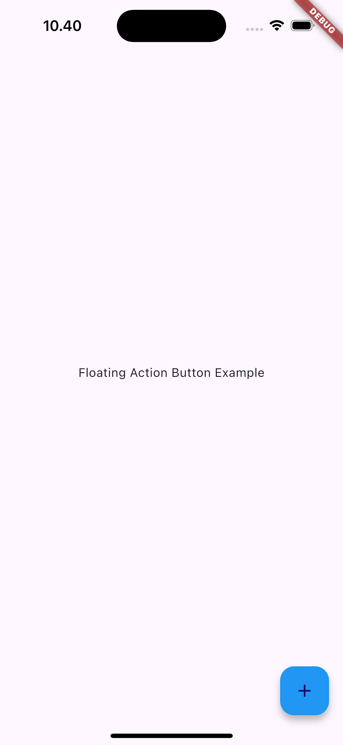
¶ 3. backgroundColor
Specifies the background color of the FAB. If not provided, it defaults to the theme’s colorScheme.secondary.
FloatingActionButtonComponent(
  onPressed: () {},
  child: Icon(Icons.add),
  backgroundColor: Colors.blue, // Custom background color
)
¶ 4. foregroundColor
Defines the color of the child widget (text or icon) inside the FAB.
FloatingActionButtonComponent(
  onPressed: () {},
  child: Icon(Icons.add),
  foregroundColor: Colors.white, // Color for the icon inside the FAB
)
¶ 5. tooltip
A short description that is shown when the user long presses or hovers over the FAB. This helps provide context about the action the FAB will trigger.
FloatingActionButtonComponent(
  onPressed: () {},
  child: Icon(Icons.add),
  tooltip: 'Add Item', // Tooltip shown on hover or long press
)
¶ 6. elevation
Controls the elevation (shadow) of the FAB. A higher elevation value increases the shadow size.
FloatingActionButtonComponent(
  onPressed: () {},
  child: Icon(Icons.add),
  elevation: 6.0, // Elevation of the FAB
)
¶ 7. shape
Defines the shape of the FAB. By default, the FAB is circular, but it can be customized with a RoundedRectangleBorder or other ShapeBorder.
FloatingActionButtonComponent(
  onPressed: () {},
  child: Icon(Icons.add),
  shape: RoundedRectangleBorder( // Change FAB shape
    borderRadius: BorderRadius.circular(10),
  ),
)
¶ 8. isExtended
Determines whether the FAB should be in the extended form, which displays both an icon and a label. If true, the FAB will use the FloatingActionButton.extended widget.
FloatingActionButtonComponent(
  onPressed: () {},
  child: Text('Add'),
  isExtended: true, // Use extended FAB with label
)
¶ 9. hoverElevation
Defines the elevation of the FAB when it is hovered over, typically on web platforms.
FloatingActionButtonComponent(
  onPressed: () {},
  child: Icon(Icons.add),
  hoverElevation: 10.0, // Elevation on hover
)
¶ 10. focusElevation
Defines the elevation of the FAB when it is focused, for example, when using keyboard navigation.
FloatingActionButtonComponent(
  onPressed: () {},
  child: Icon(Icons.add),
  focusElevation: 8.0, // Elevation when FAB is focused
)
¶ 11. disabledElevation
Specifies the elevation of the FAB when it is disabled.
FloatingActionButtonComponent(
  onPressed: null, // Disabled state
  child: Icon(Icons.add),
  disabledElevation: 2.0, // Elevation when FAB is disabled
)
¶ 12. autofocus
If true, the FAB will automatically receive focus when the screen is displayed.
FloatingActionButtonComponent(
  onPressed: () {},
  child: Icon(Icons.add),
  autofocus: true, // Automatically focuses the FAB
)