The Switch widget in Flutter is a material design toggle that allows the user to switch between two states: on or off. It is typically used to toggle between options such as turning a setting on or off, enabling or disabling a feature, or toggling between modes (e.g., light/dark mode). The switch can be customized with properties such as activeColor, inactiveThumbColor, and more.
¶ Component
import 'package:flutter/gestures.dart';
import 'package:flutter/material.dart';

class SwitchComponent extends StatelessWidget {
  final bool value; // The current state of the switch (on/off)
  final ValueChanged<bool> onChanged; // Callback for when the switch state changes
  final Color? activeColor; // Color of the switch thumb when the switch is on
  final Color? inactiveThumbColor; // Color of the switch thumb when the switch is off
  final Color? activeTrackColor; // Color of the switch track when the switch is on
  final Color? inactiveTrackColor; // Color of the switch track when the switch is off
  final MaterialTapTargetSize? materialTapTargetSize; // Controls the minimum tap area size
  final DragStartBehavior dragStartBehavior; // How dragging is handled
  final FocusNode? focusNode; // Controls the switch's focus state
  final bool autofocus; // Controls whether the switch should be focused when created
  final Color? focusColor; // Color of the switch when it is focused
  final Color? hoverColor; // Color of the switch when it is hovered over

  const SwitchComponent({
    super.key,
    required this.value,
    required this.onChanged,
    this.activeColor,
    this.inactiveThumbColor,
    this.activeTrackColor,
    this.inactiveTrackColor,
    this.materialTapTargetSize,
    this.dragStartBehavior = DragStartBehavior.start,
    this.focusNode,
    this.autofocus = false,
    this.focusColor,
    this.hoverColor,
  });

  @override
  Widget build(BuildContext context) {
    return Switch(
      value: value,
      onChanged: onChanged,
      activeColor: activeColor,
      inactiveThumbColor: inactiveThumbColor,
      activeTrackColor: activeTrackColor,
      inactiveTrackColor: inactiveTrackColor,
      materialTapTargetSize: materialTapTargetSize,
      dragStartBehavior: dragStartBehavior,
      focusNode: focusNode,
      autofocus: autofocus,
      focusColor: focusColor,
      hoverColor: hoverColor,
    );
  }
}¶ How to Use
import 'package:flutter/material.dart';
import 'switch_component.dart';
void main() {
runApp(MyApp());
}
class MyApp extends StatefulWidget {
@override
_MyAppState createState() => _MyAppState();
}
class _MyAppState extends State<MyApp> {
bool _isSwitched = false;
@override
Widget build(BuildContext context) {
return MaterialApp(
home: Scaffold(
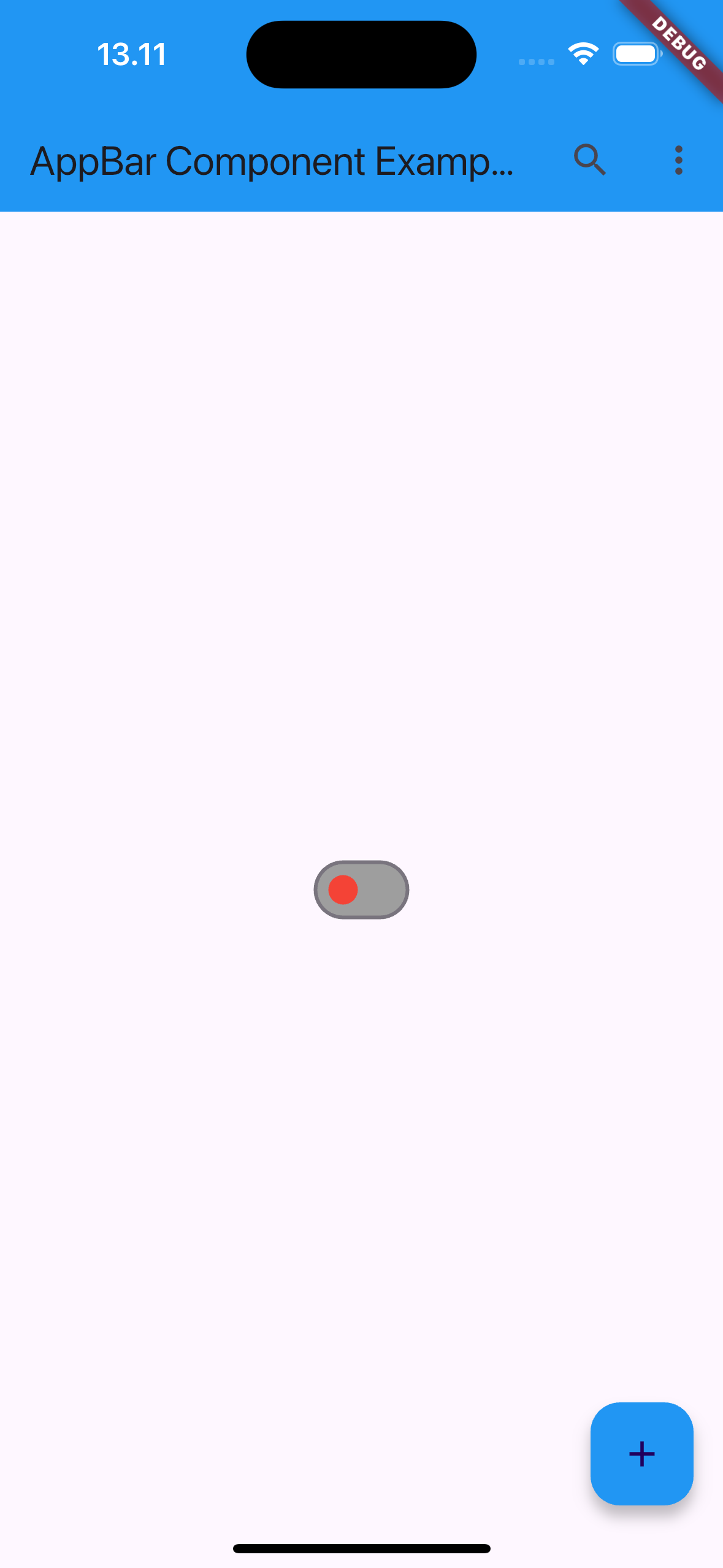
appBar: AppBar(
title: Text('Switch Component Example'),
),
body: Center(
child: SwitchComponent(
value: _isSwitched,
activeColor: Colors.green,
inactiveThumbColor: Colors.red,
activeTrackColor: Colors.lightGreen,
inactiveTrackColor: Colors.grey,
onChanged: (bool newValue) {
setState(() {
_isSwitched = newValue;
});
print('Switch state: $_isSwitched');
},
),
),
),
);
}
}
 |
 |
¶ Properties
¶ 1. value
Represents the current state of the switch. true means the switch is on; false means the switch is off.
SwitchComponent(
  value: true, // The switch is on
  onChanged: (bool newValue) {
    print('Switch changed: $newValue');
  },
)
¶ 2. onChanged
A callback function that is triggered whenever the user changes the switch’s state (on/off). It passes the new value (true for on, false for off) to the function.
SwitchComponent(
  value: false, // Initial state is off
  onChanged: (bool newValue) {
    print('Switch changed: $newValue');
  },
)
¶ 3. activeColor
The color of the switch thumb (the round button) when the switch is in the on position.
SwitchComponent(
  value: true,
  activeColor: Colors.green, // Green thumb when switch is on
  onChanged: (bool newValue) {
    print('Switch changed: $newValue');
  },
)
¶ 4. inactiveThumbColor
The color of the switch thumb when the switch is in the off position.
SwitchComponent(
  value: false,
  inactiveThumbColor: Colors.red, // Red thumb when switch is off
  onChanged: (bool newValue) {
    print('Switch changed: $newValue');
  },
)
¶ 5. activeTrackColor
The color of the track (the line the thumb slides along) when the switch is in the on position.
SwitchComponent(
  value: true,
  activeTrackColor: Colors.lightGreen, // Light green track when switch is on
  onChanged: (bool newValue) {
    print('Switch changed: $newValue');
  },
)
¶ 6. inactiveTrackColor
The color of the track when the switch is in the off position.
SwitchComponent(
  value: false,
  inactiveTrackColor: Colors.grey, // Grey track when switch is off
  onChanged: (bool newValue) {
    print('Switch changed: $newValue');
  },
)
¶ 7. materialTapTargetSize
Controls the minimum size of the switch’s tap area. This is useful for making small switches more accessible to taps.
SwitchComponent(
  value: true,
  materialTapTargetSize: MaterialTapTargetSize.shrinkWrap, // Smaller tap target
  onChanged: (bool newValue) {
    print('Switch changed: $newValue');
  },
)
¶ 8. dragStartBehavior
Determines when the drag action begins. It controls whether dragging starts when the thumb is first touched (start) or when the touch begins to move (down).
SwitchComponent(
  value: true,
  dragStartBehavior: DragStartBehavior.down, // Begin dragging on touch down
  onChanged: (bool newValue) {
    print('Switch changed: $newValue');
  },
)
¶ 9. focusNode
Manages the focus state of the switch, allowing it to receive focus via keyboard or other hardware input.
FocusNode _focusNode = FocusNode();
SwitchComponent(
  value: true,
  focusNode: _focusNode, // Assign focus control to the switch
  onChanged: (bool newValue) {
    print('Switch changed: $newValue');
  },
)
¶ 10. autofocus
If true, the switch automatically receives focus when it is built. This can be useful for keyboard or accessibility navigation.
SwitchComponent(
  value: true,
  autofocus: true, // Automatically focuses on the switch
  onChanged: (bool newValue) {
    print('Switch changed: $newValue');
  },
)
¶ 11. focusColor
The color of the switch when it is focused (e.g., when the user navigates to it using a keyboard).
SwitchComponent(
  value: true,
  focusColor: Colors.blue, // Blue outline when focused
  onChanged: (bool newValue) {
    print('Switch changed: $newValue');
  },
)
¶ 12. hoverColor
The color of the switch when it is hovered over, typically on web and desktop platforms.
SwitchComponent(
  value: true,
  hoverColor: Colors.orange, // Orange outline when hovered
  onChanged: (bool newValue) {
    print('Switch changed: $newValue');
  },
)