The Text widget in Flutter is one of the most basic and widely used widgets. It is used to display a string of text with various styling options. You can customize its appearance by changing its font, size, color, alignment, and more. The Text widget is highly flexible and can be styled using the TextStyle class to enhance its visual presentation.
¶ Component
import 'package:flutter/material.dart';

class TextComponent extends StatelessWidget {
  final String text;
  final TextStyle? style;
  final TextAlign? textAlign;
  final int? maxLines;
  final TextOverflow? overflow;
  final TextScaler? textScaler;
  final Locale? locale;
  final TextDirection? textDirection;
  final StrutStyle? strutStyle;

  const TextComponent({
    Key? key,
    required this.text,
    this.style,
    this.textAlign,
    this.maxLines,
    this.overflow,
    this.textScaler,
    this.locale,
    this.textDirection,
    this.strutStyle,
  }) : super(key: key);

  @override
  Widget build(BuildContext context) {
    return Center(
      child: Text(
        text,
        style: style,
        textAlign: textAlign,
        maxLines: maxLines,
        overflow: overflow,
        textScaler: textScaler, // Apply textScaler to textScaleFactor
        locale: locale,
        textDirection: textDirection,
        strutStyle: strutStyle,
      ),
    );
  }
}¶ How to Use
import 'package:flutter/material.dart';
import 'package:flutter_aigs_sdk/widgets/text/text_component.dart';
void main() {
runApp(const MainApp());
}
class MainApp extends StatelessWidget {
const MainApp({super.key});
@override
Widget build(BuildContext context) {
return MaterialApp(
home: Scaffold(
body: Center(
child: TextComponent(
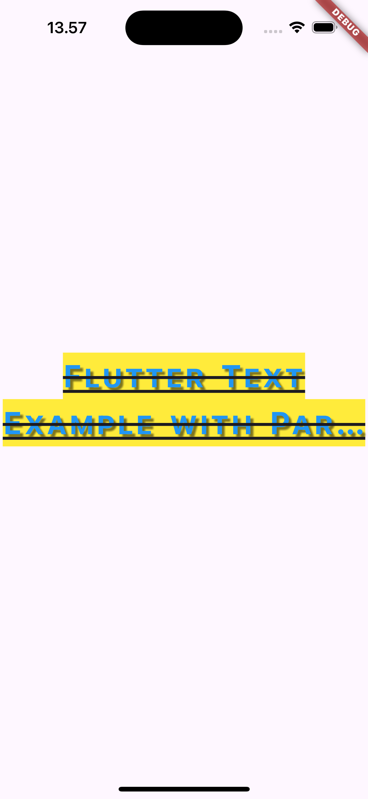
text: 'Flutter Text Example with Parameters!',
style: TextStyle(
fontSize: 28,
fontWeight: FontWeight.bold,
color: Colors.blue,
background: Paint()..color = Colors.yellow,
shadows: [
Shadow(
blurRadius: 5.0,
color: Colors.black.withOpacity(0.5),
offset: Offset(3, 3),
),
],
decoration: TextDecoration.combine([
TextDecoration.underline,
TextDecoration.lineThrough,
]),
letterSpacing: 2.0,
wordSpacing: 5.0,
height: 1.5,
fontFeatures: const [FontFeature.enable('smcp')],
),
textAlign: TextAlign.center,
maxLines: 2,
overflow: TextOverflow.ellipsis,
textScaler: const TextScaler.linear(
1.2),
locale: const Locale('en', 'US'),
textDirection: TextDirection.ltr,
strutStyle: const StrutStyle(
fontSize: 28,
height: 1.5,
),
),
),
),
);
}
}
¶ Properties
The Text widget has several key properties that can be used to customize the text. Below are some of the commonly used properties:
¶ 1. data (required)
The actual string to display.
TextComponent(text: 'Hello, Flutter!')
¶ 2. style
This property defines the appearance of the text, such as the font, size, weight, and color. It takes a TextStyle object.
TextComponent(
  text: 'Styled Text',
  style: TextStyle(fontSize: 24, color: Colors.blue, fontWeight: FontWeight.bold),
)
¶ 3. textAlign
Specifies how the text should be aligned horizontally in its container. It takes values from the TextAlign enum (e.g., TextAlign.left, TextAlign.center, TextAlign.right).
TextComponent(
  text: 'Centered Text',
  textAlign: TextAlign.center,
)
¶ 4. maxLines
This limits the number of lines the text will occupy. If the text exceeds the specified number of lines, it will be truncated.
TextComponent(
  text: 'This is a very long text that will be truncated.',
  maxLines: 2,
)
¶ 5. overflow
Defines how the text should behave when it overflows its container. This can be useful when you have long text. You can use values like TextOverflow.ellipsis to add an ellipsis at the end of the text.
TextComponent(
  text: 'This is some text that is too long to fit.',
  overflow: TextOverflow.ellipsis,
)
¶ 6. softWrap
Determines whether the text should break at soft line breaks. Set this to true to allow wrapping or false to disable wrapping.
TextComponent(
  text: This is a long text that wraps around.',
  softWrap: true,
)
¶ 7. textDirection
Defines the text's reading direction, especially useful for right-to-left languages. Takes values from TextDirection.ltr (left-to-right) and TextDirection.rtl (right-to-left).
TextComponent(
  text: 'مرحبا Flutter',
  textDirection: TextDirection.rtl,
¶ 8. textScaleFactor
This property scales the text size by a given factor. For example, a textScaleFactor of 2.0 doubles the text size.
TextComponent(
  text: 'Scaled Text',
  textScaleFactor: 1.5, // Text will be 1.5 times bigger than the original size
)
¶ 9. locale
Specifies the Locale of the text, which can affect how certain characters are displayed. It is particularly useful when dealing with multiple languages.
TextComponent(
  text: 'مرحبا',
  locale: Locale('ar', 'AE'), // Arabic locale for proper rendering
)
¶ 10. semanticsLabel
Provides an alternative label for screen readers, enhancing accessibility. If this property is set, the screen reader reads the label instead of the visible text.
TextComponent(
  text: 'Flutter Rocks!',
  semanticsLabel: 'Flutter Framework',
)
¶ 11. textWidthBasis
Determines how the width of the text is calculated. It can take two values:
TextWidthBasis.longestLine: Width is based on the longest line in the text.TextWidthBasis.parent: Width is based on the width of the parent container.
TextComponent(
  text: 'Width Basis Example',
  textWidthBasis: TextWidthBasis.parent, // Parent container dictates the width
)
¶ 12. strutStyle
Defines the StrutStyle, which is used to control the vertical layout of the text. It affects line height, leading, and baseline alignment, improving consistency for text rendered across different styles.
TextComponent(
  text: 'Strut Style Example',
  strutStyle: StrutStyle(
    fontSize: 16,
    height: 1.5, // Line height as a multiplier of the font size
  ),
)
¶ 13. textHeightBehavior
Controls how the height of the text is applied, particularly how the leading (the space above and below text lines) is handled. You can control whether the text will have top or bottom space removed.
TextComponent(
  text: 'Height Behavior Example',
  style: TextStyle(fontSize: 20),
  textHeightBehavior: TextHeightBehavior(
    applyHeightToFirstAscent: false,
    applyHeightToLastDescent: false,
  ),
)¶ 14. key
The key property helps Flutter manage the state of widgets. It’s mainly used in situations where the widget needs to be preserved during a rebuild or for performance optimization in lists.
TextComponent(
  text: 'Key Example',
  key: ValueKey('unique_key'),
)¶ 8. textDirection
The direction in which the text should be displayed, either left-to-right (TextDirection.ltr) or right-to-left (TextDirection.rtl).
TextComponent(
  text: 'RTL Text Example',
  textDirection: TextDirection.rtl, // Right-to-left direction for languages like Arabic or Hebrew
)¶ 9. shadows (in TextStyle)
Adds a shadow effect behind the text. You can define multiple shadows, each with its own blur, offset, and color.
TextComponent(
  text: 'Shadow Text',
  style: TextStyle(
    fontSize: 40,
    shadows: blurRadius: 10.0,
        color: Colors.black.withOpacity(0.5),
        offset: Offset(5, 5), // Shadow position
      ),
    ],
  ),
)¶ 10. letterSpacing (in TextStyle)
Specifies the spacing between characters in the text. Positive values increase the space, while negative values decrease it.
TextComponent(
  text: 'Letter Spacing Example',
  style: TextStyle(
    letterSpacing: 2.0, // Increased spacing between characters
  ),
)¶ 11. wordSpacing (in TextStyle)
Sets the spacing between words. It is similar to letterSpacing, but applies to spaces between words.
TextComponent(
  text: 'Word Spacing Example',
  style: TextStyle(
    wordSpacing: 5.0, // Increased spacing between words
  ),
)¶ 12. decoration (in TextStyle)
Defines a text decoration such as underline, overline, or line-through (strikethrough).
TextComponent(
  text: 'Underlined Text',
  style: TextStyle(
    decoration: TextDecoration.underline, // Underlines the text
  ),
)You can also combine multiple decorations:
TextComponent(
  text: 'Combined Decorations',
  style: TextStyle(
    decoration: TextDecoration.combine([
      TextDecoration.underline,
      TextDecoration.lineThrough,
    ]),
  ),
)¶ 13. fontFeatures (in TextStyle)
Allows you to enable specific typographical features like small caps or old-style figures, providing finer control over font behavior.
TextComponent(
  text: 'Font Features Example',
  style: TextStyle(
    fontFeatures: [FontFeature.enable('smcp')], // Enables small caps if supported
  ),
)¶ 14. foreground & background (in TextStyle)
The foreground and background properties allow for advanced customization by applying a Paint object to define the appearance of the text or its background.
- foreground: Controls the color or style of the text using
Paint. - background: Controls the background color/style behind the text.
TextComponent(
  text: 'Foreground and Background Example',
  style: TextStyle(
    fontSize: 40,
    foreground: Paint()..color = Colors.blue, // Text color is blue
    background: Paint()..color = Colors.yellow, // Background color is yellow
  ),
)¶ 15. height (in TextStyle)
Controls the line height as a multiple of the font size. Setting a height greater than 1.0 increases the space between lines.
TextComponent(
  text: 'Line Height Example',
  style: TextStyle(
    fontSize: 20,
    height: 1.5, // 1.5 times the font size
  ),
)