The TextField widget in Flutter is used to receive text input from the user. It is a key element in form-based applications, allowing users to type text into your app. The TextField widget supports a wide range of features like input decoration, controlling text input, validation, and much more.
¶ Component
import 'package:flutter/material.dart';

class TextFieldComponent extends StatelessWidget {
  final TextEditingController? controller;
  final InputDecoration? decoration;
  final TextInputType? keyboardType;
  final bool obscureText;
  final bool enabled;
  final int? maxLength;
  final int? maxLines;
  final String? initialValue;
  final ValueChanged<String>? onChanged;
  final ValueChanged<String>? onSubmitted;
  final TextInputAction? textInputAction;
  final FocusNode? focusNode;
  final bool autofocus;
  final TextCapitalization textCapitalization;
  final TextAlign textAlign;

  // Constructor to allow parameters for each property
  const TextFieldComponent({
    Key? key,
    this.controller,
    this.decoration,
    this.keyboardType,
    this.obscureText = false,
    this.enabled = true,
    this.maxLength,
    this.maxLines = 1,
    this.initialValue,
    this.onChanged,
    this.onSubmitted,
    this.textInputAction,
    this.focusNode,
    this.autofocus = false,
    this.textCapitalization = TextCapitalization.none,
    this.textAlign = TextAlign.start,
  }) : super(key: key);

  @override
  Widget build(BuildContext context) {
    return TextField(
      controller: controller,
      decoration: decoration,
      keyboardType: keyboardType,
      obscureText: obscureText,
      enabled: enabled,
      maxLength: maxLength,
      maxLines: maxLines,
      onChanged: onChanged,
      onSubmitted: onSubmitted,
      textInputAction: textInputAction,
      focusNode: focusNode,
      autofocus: autofocus,
      textCapitalization: textCapitalization,
      textAlign: textAlign,
    );
  }
}
¶ How to Use
import 'package:flutter/material.dart';
import 'text_field_component.dart';
void main() {
runApp(MyApp());
}
class MyApp extends StatelessWidget {
final TextEditingController _controller = TextEditingController();
@override
Widget build(BuildContext context) {
return MaterialApp(
home: Scaffold(
appBar: AppBar(title: Text('TextField Component Example')),
body: Padding(
padding: const EdgeInsets.all(16.0),
child: Column(
children: [
TextFieldComponent(
controller: _controller,
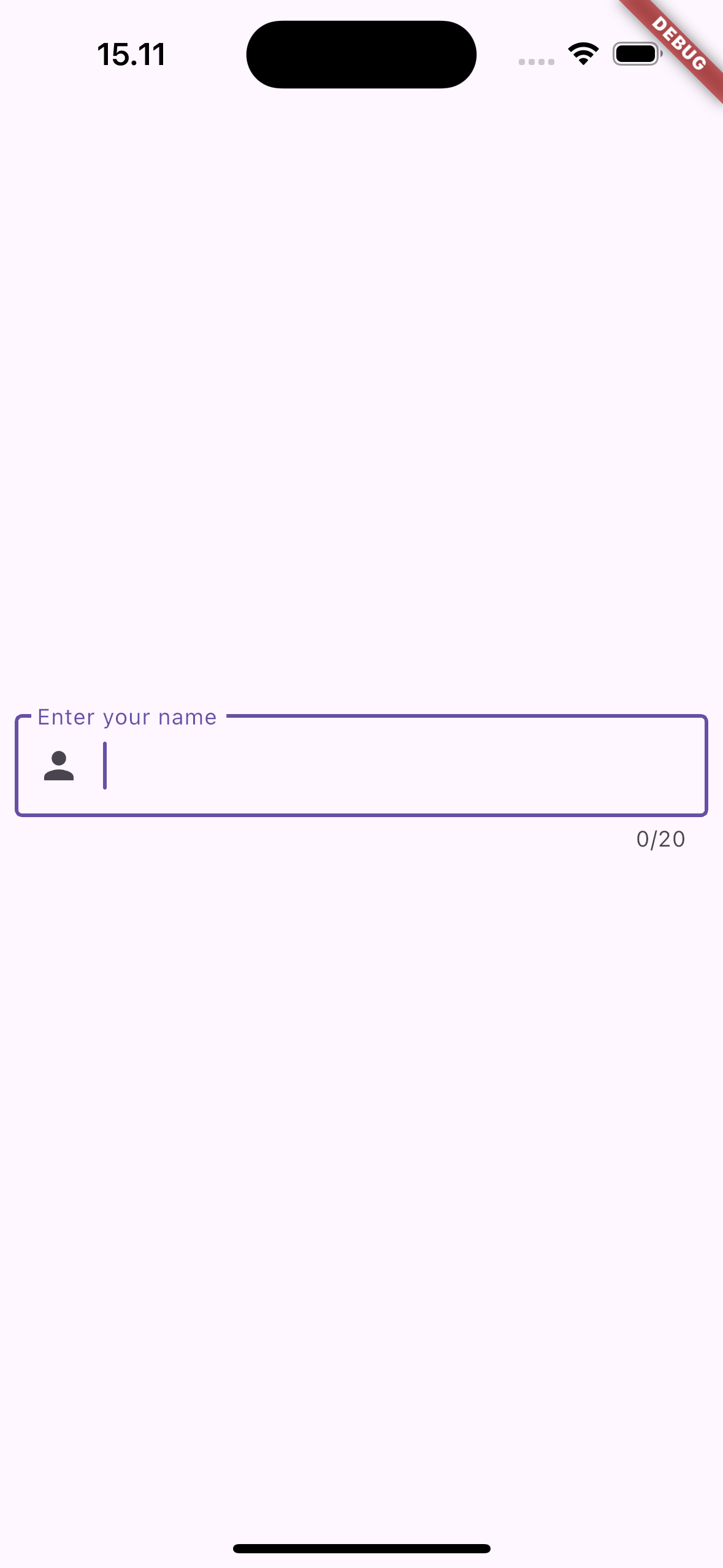
decoration: InputDecoration(
labelText: 'Enter your name',
border: OutlineInputBorder(),
prefixIcon: Icon(Icons.person),
),
keyboardType: TextInputType.text,
obscureText: false,
maxLength: 20,
maxLines: 1,
onChanged: (value) {
print('Input changed: $value');
},
onSubmitted: (value) {
print('Input submitted: $value');
},
textInputAction: TextInputAction.done,
autofocus: true,
textCapitalization: TextCapitalization.words,
textAlign: TextAlign.left,
),
],
),
),
),
);
}
}
¶ Properties
¶ 1. controller
Manages the text in the TextField. You can use it to programmatically access or modify the text and listen to changes.
TextEditingController _controller = TextEditingController();
TextFieldComponent(controller: _controller)
¶ 2. decoration
Customizes the visual appearance of the TextField, including labels, borders, hint text, icons, etc.
TextFieldComponent(
  decoration: InputDecoration(
    labelText: 'Enter your name',
    border: OutlineInputBorder(),
    prefixIcon: Icon(Icons.person),
  ),
)
¶ 3. keyboardType
Specifies the type of keyboard to show when the TextField is focused, such as email, text, phone, or number input.
TextFieldComponent(keyboardType: TextInputType.emailAddress)
¶ 4. obscureText
Hides the text being entered (used for passwords or sensitive data fields).
TextFieldComponent(obscureText: true) // Hides text for password input
¶ 5. enabled
Enables or disables the TextField. If false, the TextField will be non-interactive and grayed out.
TextFieldComponent(enabled: false) // Disables the TextField
¶ 6. maxLength
Sets the maximum number of characters allowed in the TextField. If set, a character counter is displayed below the field.
TextFieldComponent(maxLength: 20) // Limits input to 20 characters
¶ 7. maxLines
Sets the number of lines for the TextField. If null, the field will grow to fit multiple lines as needed.
TextFieldComponent(maxLines: 3) // Allows the text to span 3 lines
¶ 8. onChanged
Callback function that is triggered whenever the text changes. It allows you to respond to the user’s input in real-time.
TextFieldComponent(
  onChanged: (value) {
    print('Text changed: $value');
  },
)
¶ 9. onSubmitted
Callback function that is triggered when the user submits the text (e.g., by pressing "Enter" or "Done" on the keyboard).
TextFieldComponent(
  onSubmitted: (value) {
    print('Text submitted: $value');
  },
)
¶ 10. textInputAction
Defines the action button displayed on the keyboard (e.g., "Done", "Next", "Go"). This is useful when building multi-step forms.
TextFieldComponent(textInputAction: TextInputAction.done)
¶ 11. autofocus
If true, the TextField will automatically focus when the widget is built and displayed.
TextFieldComponent(autofocus: true)
¶ 12. textCapitalization
Controls how the text is capitalized (e.g., capitalize the first letter of words, sentences, or not at all).
TextFieldComponent(textCapitalization: TextCapitalization.words)
¶ 13. textAlign
Defines how the text is aligned inside the TextField. It can be left-aligned (start), right-aligned (end), or center-aligned.
TextFieldComponent(textAlign: TextAlign.center)